")
")
CSS Art Rubik’s Cube Tutorial

The CSS Art Rubik’s Cube wasn’t planned — it appeared during one of the ruSSian missile-and-drone attacks. On the way to the shelter with my kids and a laptop, I had to invent something to keep them calm, so we started “drawing” with code.
We decided to recreate my logo — a Rubik’s-like cube with MYSQL, PHP, HTML and CSS on its faces. My middle son dreams of becoming a game developer, and he loved it.
Later, when I got back to my main workstation, I decided to share what we made here on the blog.
CSS Art Rubik’s Cube – final result:
S
S
C
Y
M
P
T
H
P
Q
L
M
Basic HTML structure:
<div class="wa-scene">
  <div class="wa-cube" tabindex="0">
    <div class="wa-cube-face wa-face-top"><span class="wa-letter">A</span></div>
    <div class="wa-cube-face wa-face-left"><span class="wa-letter">B</span></div>
    <div class="wa-cube-face wa-face-right"><span class="wa-letter">C</span></div>
  </div>
</div>
The main container .wa-scene centers everything on the page. Then .wa-cube defines the 3D perspective, and inside it, the three .wa-cube-face blocks represent the cube’s faces. Here’s the CSS for them:
:root {
	--wa-cube-size: 352px;
	--wa-cube-half: calc(var(--wa-cube-size) / 2);
}
.wa-scene {
	width: 780px;
	height: 780px;
	display: flex;
	align-items: center;
	justify-content: center;
}
.wa-cube {
	width: var(--wa-cube-size);
	height: var(--wa-cube-size);
	position: relative;
	transform-style: preserve-3d;
	transform: rotateX(25deg) rotateY(-45deg);
	transition: transform .35s ease;
	cursor: pointer;
	outline: none;
}
.wa-cube-face {
	position: absolute;
	width: var(--wa-cube-size);
	height: var(--wa-cube-size);
	display: flex;
	align-items: center;
	justify-content: center;
	box-shadow: 0 6px 10px rgba(0,0,0,0.15);
	font-family: system-ui, sans-serif;
	font-weight: 700;
	font-size: calc(var(--wa-cube-size) * 0.24);
	color: #000;
	user-select: none;
	transform-origin: center center;
	border: 1px solid #000;
	border-radius: 5px;
}
At this point, it doesn’t look much like a cube, right? That’s because all faces use position: absolute and stack on top of each other. Let’s give each face its own transform:
.wa-face-top {
	background: #ffd24d;
	transform: rotateX(90deg) translateZ(var(--wa-cube-half));
}
.wa-face-left {
	background: #3fb0e7;
	transform: rotateY(-90deg) translateZ(var(--wa-cube-half));
}
.wa-face-right {
	background: #ff6b90;
	transform: rotateY(180deg) translateZ(var(--wa-cube-half));
}
Now we’ve got a proper cube, but the letters are facing the wrong way. Let’s fix that with another transform for the letters:
.wa-face-top .wa-letter {
	transform: rotateZ(90deg) rotateY(180deg);
}
.wa-face-left .wa-letter,
.wa-face-right .wa-letter {
	transform: rotateY(180deg);
}
Here’s what we have at this stage:
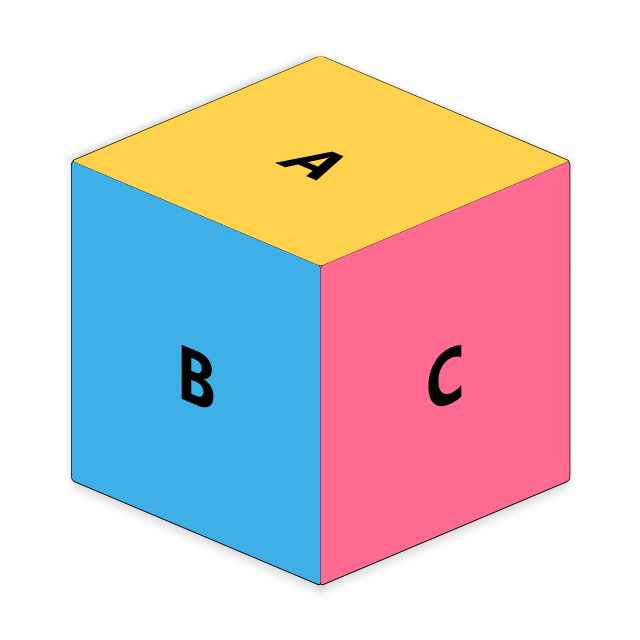
At this stage, it already looks much better — a real 3D cube with correctly oriented letters on each face.
Turning it into a Rubik’s Cube
To turn it into a Rubik’s cube, we’ll add a grid container inside each .wa-cube-face, like this:
<div class="wa-cube-face wa-face-top">
	<div class="wa-cube-grid">
		<div class="wa-cube-cell wa-top-one"></div>
		<div class="wa-cube-cell wa-top-two"></div>
		<div class="wa-cube-cell wa-top-three"></div>
		<div class="wa-cube-cell wa-top-four"></div>
		<div class="wa-cube-cell wa-top-five"></div>
		<div class="wa-cube-cell wa-top-six"></div>
		<div class="wa-cube-cell wa-top-seven"></div>
		<div class="wa-cube-cell wa-top-eight"></div>
		<div class="wa-cube-cell wa-top-nine"></div>
	</div>
</div>
And here’s the CSS for those elements:
.wa-cube-grid {
	display: grid;
	grid-template-columns: repeat(3, 1fr);
	grid-template-rows: repeat(3, 1fr);
	width: 100%;
	height: 100%;
}

.wa-cube-cell {
	display: flex;
	align-items: center;
	justify-content: center;
	transform-style: preserve-3d;
	box-sizing: border-box;
	border: 2px solid #000;
	border-radius: 4px;
	box-shadow: inset 0 0 0 1px rgba(0,0,0,0.2);
}
Now each face can have its own color pattern — just like a real Rubik’s cube. I used the same color scheme as on my logo:
.wa-cube-cell.wa-top-one {
	background: #f30f18;
}
...
.wa-cube-cell.wa-top-nine {
	background: #49ba6f;
}
.wa-cube-cell.wa-left-one {
	background: linear-gradient(90deg, #0d68b2, #005ba4);
}
...
.wa-cube-cell.wa-left-nine {
	background: linear-gradient(90deg, #32894f, #016a29);
}
.wa-cube-cell.wa-right-one {
	background: linear-gradient(90deg, #ffce00, #f6e80a);
}
...
.wa-cube-cell.wa-right-nine {
	background: linear-gradient(90deg, #ddd, #fff);
}
This small experiment shows how far CSS and careful transforms can take you: from simple face blocks to a convincing 3D Rubik’s cube built purely with HTML and CSS. The technique scales — swap sizes, tweak transforms, add more faces — and you get a neat interactive logo or a playful demo to share. It started as a simple shelter distraction — and ended as a CSS Art Rubik’s Cube, proving how creative code can become, even under the simplest tools.
Related posts:

Good, fast, cheap. Pick two.
You’ve probably know the phrase: “Good fast cheap. Pick two”. This concept has a few different names: it’s known as the Triple Constraint, Iron Triangle but most popular [...]")
Heart via CSS Art for all lovers :)
Today I want to congratulate all visitors of my blog with Valentine Day. And I decided to do the heart because this is mean the simbol of love. [...]